Financial report
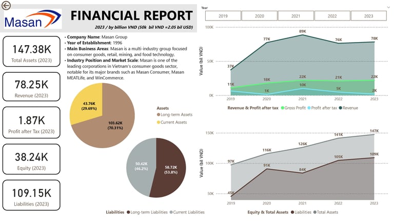
To create a Power BI report that analyzes the financial situation of Masan and facilitates investment decision-making, consider including the following key charts and metrics:
Revenue and Profit Chart over the Years
Use a bar or line chart to compare revenue, gross profit, and net profit over time (quarterly or annually).
Include year-over-year revenue growth to highlight development trends.
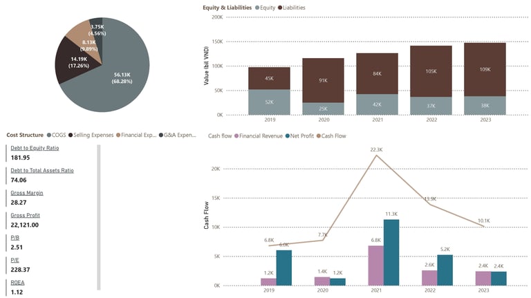
Cost Structure Chart
Implement a pie chart or stacked bar chart to show the proportion of various costs, including cost of goods sold, operating expenses, selling expenses, and administrative expenses.
This visualization clarifies the cost structure and its impact on profitability.
Debt-to-Equity Ratio Chart
Display a bar or line chart illustrating the debt-to-equity ratio over time.
This metric assesses the financial risk level of the company.
Profitability Ratios
Present important profitability ratios such as gross margin, net profit margin, and return on equity (ROE).
Use card visuals for easy comparison of these critical indicators.
Cash Flow Chart
Utilize a line or area chart to depict cash flow from operating, investing, and financing activities.
This helps evaluate the company's cash management capabilities.
Sale report
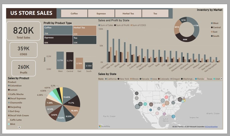
The data includes 20 columns and over 4,000 rows. The tasks involve editing, cleaning, and standardizing the data, as well as data simulation. The data analysis aims to provide the following information:
Total quantity of products sold
Total revenue
Proportion of each type of product
Comparison of sales, profit, and cog volumes between stages of US
Comparison of product sales volumes between stages
Visualized sales volumes between stages of US
HR Report
This is a multinational company with 9 broad verticals across the organization (departments) and over 20,000 employees.
One of the problems my client is facing is identifying the right people for promotion (only for manager position and below) and preparing them in time.
For the old process, the final promotions are only announced after the evaluation and this leads to delay in transition to their new roles. Hence, the company needs help in identifying the eligible candidates at a particular checkpoint so that they can expedite the entire promotion cycle.
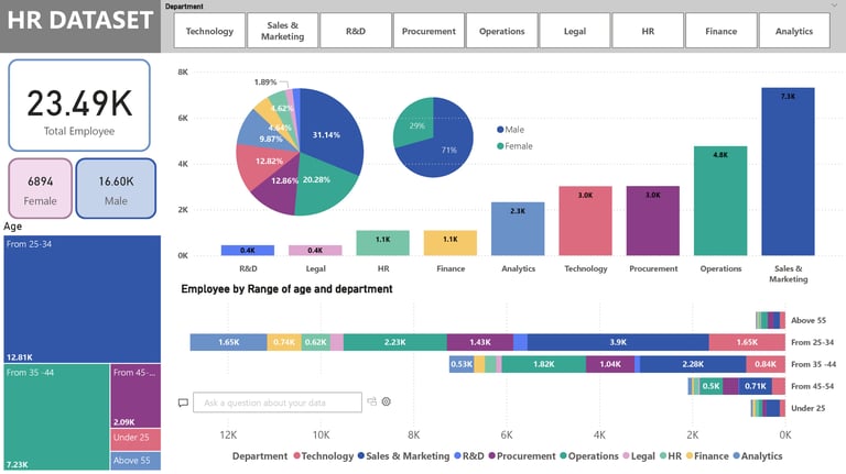
In the company’s personnel chart, the following information can be easily identified:
The total number of employees currently in the company.
The total number and percentage of employees in each department.
The number of male and female employees.
The number and percentage of employees in different age groups (under 25, 25-34, 35-44, 45-54, and over 55).
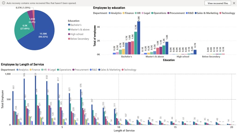
The number and percentage of employees' educational levels in each department.
The number and percentage of employees categorized by years of service.
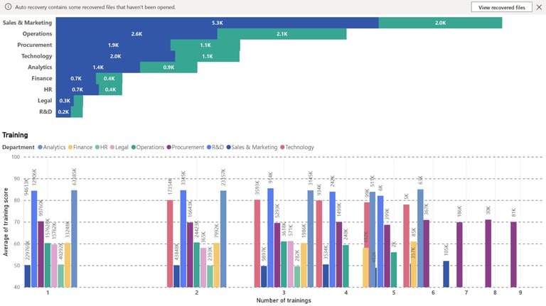
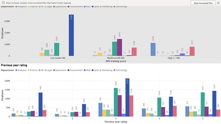
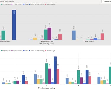
The number and percentage of employees classified according to average training scores and the number of training courses (low, medium, high).
The number and percentage of employees achieving over 80% KPI in each department.
The number and percentage of employees classified according to the evaluation score from the previous year.
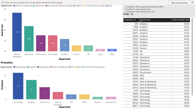
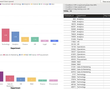
The number and percentage of employees who have achieved awards in each department.
A proposed promotion list based on criteria (KPI > 80%, average training score > 80, having achievements, meeting evaluation scores from the last 5 years).
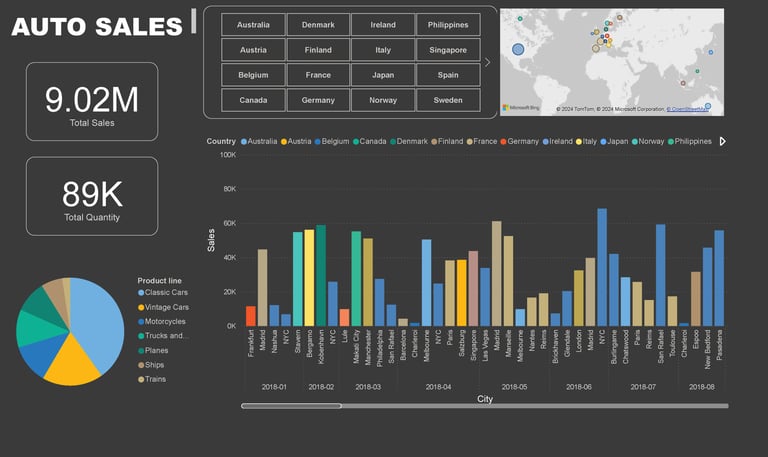
Auto sale report
The data includes 20 columns and over 1,000 rows. The tasks involve editing, cleaning, and standardizing the data, as well as data simulation. The data analysis aims to provide the following information:
Total quantity of products sold
Total revenue
Proportion of each type of product
Comparison of order volumes between countries
Comparison of order volumes between cities over time
